


Colour Psychology in Interior Design
Have you ever considered why you feel more relaxed after spending time in a neutral, light space? Or energised after being in a colourful, vibrant room? It’s probably largely down to colour psychology (the connection between our emotions and colour), making a huge impact within interior design schemes. Colour psychology suggests that colour has the power to influence productivity, energy levels, mood and self-esteem. It’s been widely practiced in art, graphic design and marketing to engender specific feelings in consumers. Colour psychology is a cornerstone element of interior design for aesthetic purposes, but also to fully optimize each space based on the feelings and emotions each colour invokes.
Colour psychology is the brain-child of colour psychologist Angela Wright. Angela, studied psychology, and was fascinated by the psychological effects colour has on us. It’s so emotive, and certainly not just based on science. For example science would have us believe colour is merely light waves. But close your eyes, and what do you see? Colour is all around us, effecting our mood, even when we sleep.
Colour Phycology in Interior Design

Colour schemes are an important factor in Interior design. The colour of the walls, furniture, natural elements, decorative pieces, lights, and fixtures all play an important role in the psyche of the inhabitant. They spent hours surrounded by the combination of colours you choose. Therefore, it is always good to choose colour schemes based on the specific personality and desires of the homeowner.
Everyone has an opinion on colour but there is no right or wrong, bad or good when it comes to this topic.

Colour can be viewed as a language: a silent but incredibly powerful one. This global language is rich and layered and it has been proved that colour affects your quality of life and wellbeing on a largely subconscious level.
Do you ever notice that certain places especially irritate you? Or that other instead will make you feel relaxed and calm? Colours play an important part in the state of our mind. We respond psychologically to those spaces, and the colour used can affect us mentally, physically and emotionally. Scientifically, colour is one of the first things we perceive. It is a wavelength of light that is reflected back from the surface of whatever item or object we are looking at. Therefore, without light, there is no colour. The eye receives light as nervous impulses on the retina and our brains receive unconscious messages in a language that we understand instinctively. We then reflect these messages into particular emotions. However, everybody potentially can see colours slightly differently from everybody else, therefore the emotions that we recall are different.

Different shades evoke certain emotions so, when choosing your colours, it’s important to consider the kind of atmosphere you wish to create and which colours will help you achieve this.
Whether you’re looking to add the odd pop of colour or decorate your entire room, discover the psychological effect of colour in interior design with our help:
Orange

Orange is associated with joy, sunshine, and the tropics. It represents enthusiasm, fascination, happiness, creativity, determination, attraction, success, encouragement, and stimulation. It is the only colour to take its name from an object; the orange. It is a somewhat polarizing colour, as people either love or hate it.
Orange is typically best used in bedrooms as an accent to dilute and tone down the extreme effects of this bold hue. Orange has been proven to increase appetite, which is why it is well suited for indoor and outdoor kitchen areas.

In general, the brighter the shade of orange, the less of it you need. Likewise, paler and more muted oranges — such as apricot, peach, terra cotta orange, and dusty orange — are ideal for larger applications or spaces and more relaxing spaces such as bedrooms. Keep in mind that deep orange tones, while bold during the day, can feel warm and cosy in the evening.
Yellow
The colour of sunshine, yellow promotes energy, happiness, joy, and intellect. Yellow is even said to encourage communication and creativity whilst also stimulating the memory and nervous system. However, choosing the right shade of yellow is crucial, as dull yellows can be more draining than uplifting, and overly bright yellows can be too intense.

Playful yellow shades make a perfect match for children’s bedroom and nurseries, but the colour can easily be adapted to create a mature finish in almost any room you want it to.

Like so many bright tones, it can be tricky to make yellow successful in a room from top to bottom, but statement furniture and bold yellow accessories can result in delightful styling. By sticking to golden shades and utilising this colour in darkened areas of your home, you can easily bring a feeling of light into your space.
Green

The colour of grass, leaves, and other natural elements, green is also the most restful colour for the eye. Green emotes renewal, growth, fertility, freshness, and harmony; using green indoors can lend a sense of emotional safety, security, and calmness to a space.

Combining the invigorating quality of blue and the optimism of yellow, green is suitable for almost any room in the house. It stimulates thoughts of balance, growth and restoration in colour psychology. It immediately brings the natural world to mind, and encourages unwinding but has enough warmth to promote comfort and togetherness.
Blue

Undoubtedly one of the strongest hues of the colour psychology spectrum. Deep, bold tones, such as navy and royal blue, are great for evoking confidence and are usually associated with admirable qualities such as loyalty, trust, peace and success. Blue is among the most calming colours in the palette for interior design. In regards to the psychological effects of colour, blue relaxes the mind and slows down heart rate, metabolism, blood pressure, and hypertension.
Aquatic shades of blue, in particular, such as sky blue and light blue have a healing effect on the mind. It reminds the inhabitants of the sea or swimming pools. Blue is the only colour that has an array of positive effects, and little to no negative effects on the psyche.

Lighter shades of the colour instil a feeling of calm and tranquillity within the home which makes them ideally suited for bedrooms, bathrooms and living spaces with relaxation in mind.
PINK
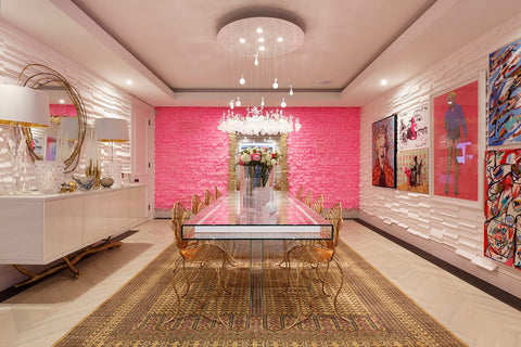
The colour pink influences emotions that are closer to the heart. When used appropriately, pink and all its shades create an atmosphere of love and compassion that needn't be reserved for little girls' bedrooms only. Given the chance, its tones are comforting making it easily transferable to living room schemes if executed well
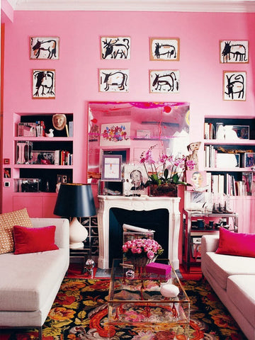
Although pink is largely associated with feminism, you can still use this colour for a masculine effect. Simple patterns and sophisticated designs can take pink to a whole new level in modern interior design trends. It instigates feelings of comfort and love. Vibrant shades of pink such as Magenta, Fuchsia, etc. help make a statement when paired with secondary colours such as light blue. You can use them to bring out the playfulness of wall patterns
Red

The most intense colour, red raises a room’s energy level and pumps the adrenaline. Ambition, action and willpower are all qualities attributed to this colour, which is why red is a great option for home offices and creative spaces. In the living or dining room, red draws people together and stimulates conversation. In an entrance hall, it creates a strong first impression. Red is never boring, it is an excellent accent colour. You can incorporate its qualities to make a ‘cool’ room warmer; red is great for kitchens and it is known to increase appetite, whilst red accent walls can instantly change the way a room is perceived.

Red also inspires feelings of anger and revenge, which is why it is best to combine it with calming colour tones such as white or beige to balance the human emotion. You can add higher nuances of red to stimulate productivity but make sure to compliment it equally.
The Colour Wheel
A basic interior design tool is the colour wheel. Understanding the following colour wheel tricks can help you apply this technique within your own home:
Complementary Colours - These are colours or hues that are directly opposite each other on the colour wheel, like blue and orange or yellow and violet. Complementary colours are usually used as accent colours in small quantities.
Triads - Triads form a triangle on the colour wheel, like yellow, blue and red; or orange, green and violet. These colours can also be used as accent colours, but they must be balanced. If not, they can overwhelm a room.
Analogous Colours - These are groups of colours that are right beside each other on the colour wheel, like red, orange and red/orange.
Monochromatic Colours - Keeping it simple, this is the use of only one colour, but in shades from dark to light, like navy to powder blue.
Cool and Warm Colours - Cool and warm colours are typically sued to create a mood in a room. Cool colours are blues, greens, and purples, while warm colours are reds, oranges, yellows, and pinks.
Non-Colours - Non-colours aren’t found on the colour wheel, but still, play a very important role in interior design. Non-colours are the greys, beiges, earth tones, browns, whites, and of course, black.


